OnlySeeker may earn a commission when readers subscribe through links on this page. It does not change what we write. Read our editorial policy.
Editor's take
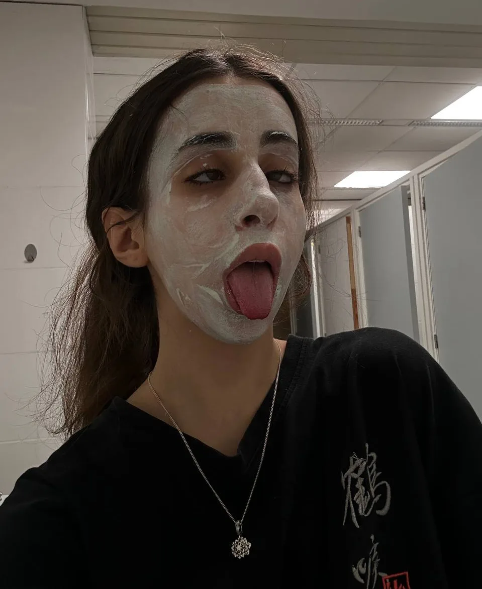
The cover is a mirror shot on a marble tile floor. She kneels against a white wall in a red ruffled two-piece and fluffy slippers, with a dark door frame at the left edge, and her phone in a dark case covers most of her face. The second picture could not be more different. It is a public bathroom with stall doors and a strip light overhead, a white clay mask drying on her face, tongue out, an oversized black tee with white characters printed across it, and a small flower pendant on a silver chain.
That second frame is the useful one. It is fully clothed, it was clearly not planned, and it matches the clumsy, giggly tone her bio claims, which is rarer than it sounds. What it does not do is tell a buyer what the feed looks like, and the cover does not either. The mirror angle in the cover is built to exaggerate, so read it as a pose and not as a measurement. Rate, schedule and reply time are all closed to us.
A reader who likes an unpolished, playful page will get more from this profile than the cover suggests. A reader who wants one consistent look across every post should keep scrolling.
At a glance
| Detail | What we found |
|---|---|
| Handle | @only_nadya |
| Primary niche | Brunette |
| Region | Not disclosed |
| Subscription price | Not disclosed |
| Posts per week | Not disclosed |
| Content style | Phone selfies, posed and candid |
| Share of pay-per-view | Not disclosed |
| Median reply time | Not disclosed |
| Verified badge | Not confirmed by us |
What we liked and what to know
What we liked
- The second photo is clothed, unplanned and shows a personality rather than a pose.
- Her bio and that picture agree with each other, which is not common on these pages.
- Both frames are sharp and bright enough to see detail in.
What to know
- Her own phone covers most of her face in the cover, which is an odd choice for a lead image.
- The two pictures are so far apart in tone that neither one predicts the feed.
- A mirror shot at that angle stretches proportion by design. Read the cover as a pose.
- The second frame was taken in a public bathroom, which says something about how carefully she picks a location.
- We found no rate on the open part of the page.
- The cover is underwear and is not one to open beside a colleague.
Who it is for
Readers who prefer a page that looks unplanned and a little silly.
Readers who care more about personality than about a polished set.
Not for readers who want one consistent look, because these two frames share almost nothing.
Questions readers ask
What do the two photos show?
A mirror selfie in a red ruffled two-piece on tile, and a clothed bathroom selfie with a clay face mask on and the tongue out.
Why criticise the cover?
Her phone hides most of her face in it, and the angle is one that stretches proportion. Both make it a weak lead image.
Does her bio match the pictures?
Partly. She describes herself as clumsy and giggly, and the face-mask photo fits that. The cover does not, and neither says what she posts.
Is a price published?
Not anywhere we can read. The field stays blank in our table. Look at the rate on the platform before you decide anything.
Have your editors subscribed?
No. This review covers open material only, so posting pace, reply speed and what a month contains are all left unrated.